Branding
There’s nothing more rewarding than helping a brand bring its vision to life. Seeing ideas grow from simple sketches to complete branding and logos out in the real world, is truly exciting.

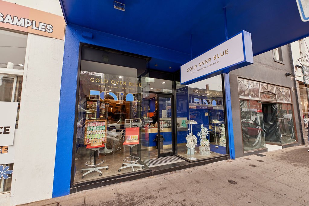
Gold Over Blue - 469 Chapel St, Melbourne, Victoria.
This project is a perfect example of taking a brand from a simple idea to a complete vision. Inspired by my client’s roots in Portugal, I brought their concept to life within the Australian market. From logos and branding to content creation and interior direction, this was a project I proudly executed from start to finish.
Gold Over Blue
-
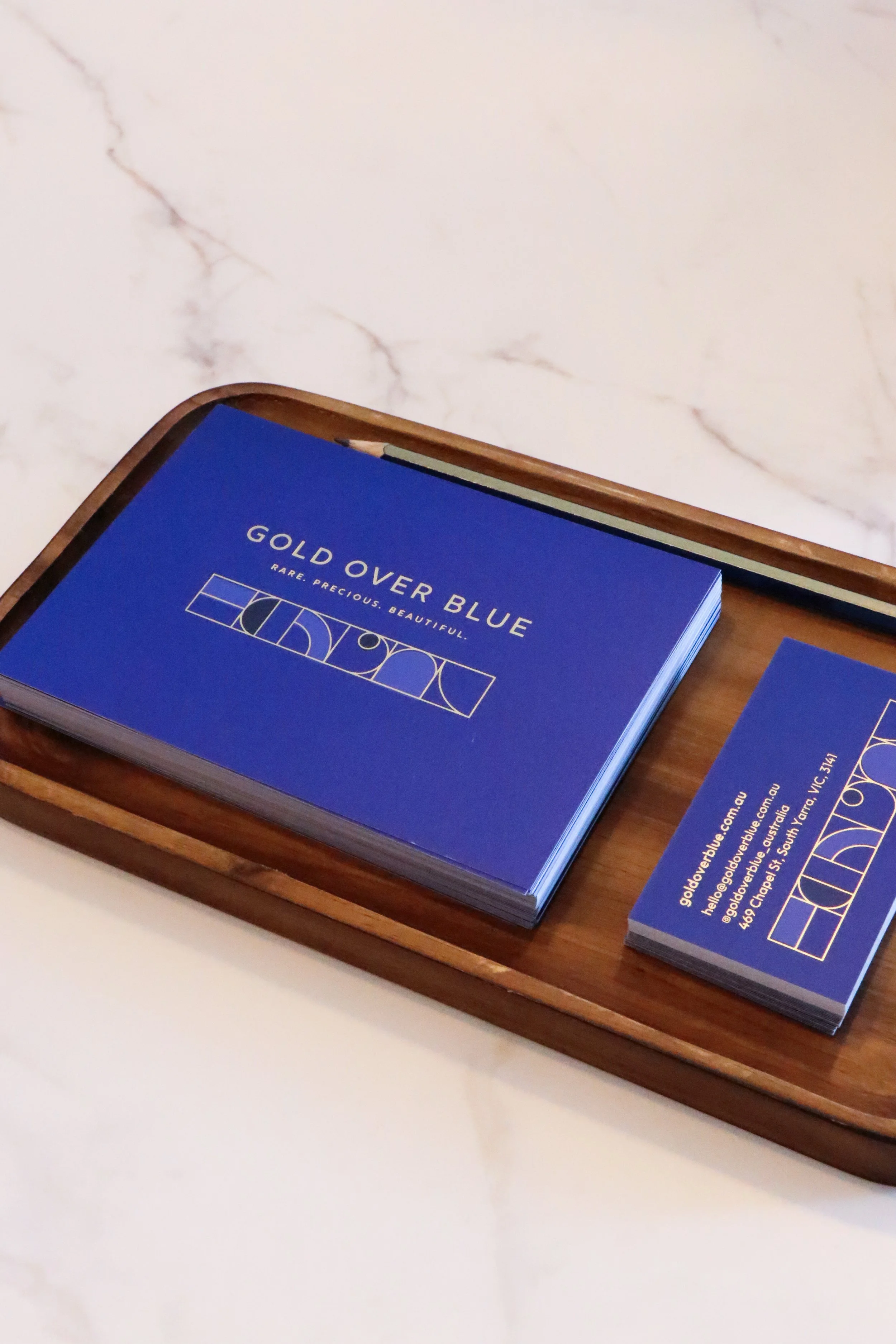
Once the brand name was settled, I designed a logo inspired by Fibonacci’s Golden Rule.
-
Once the logo and style were complete, I extended the design across a range of print materials including flyers, business cards, thank you cards, stickers and packaging.
-
Through frequent visits to the store, I worked closely with the client to bring their vision to life. From selecting paint colours to refining finishing touches like lighting and accent details, I helped ensure every element aligned with the brand’s identity.
-
I wanted their products to truly shine, so I supported the client in building their social presence. By bringing the branding to life and capturing fresh, engaging content, I helped create visuals that gave their socials a cohesive and elevated look.
-
To ensure a successful launch, I designed beautiful invitations and thoughtful details that set the tone for their opening night - a celebration that was both successful and truly memorable.
Here’s what I did:


Content Creation
and Product Photography
From coming up with visual concepts, sourcing props, setting up scenes and photographing the final settings. I incorporated natural textures and organic elements, to emphasise the craftsmanship and authenticity of the collection.


Interior Direction
To ensure the physical store reflected the brand’s presence, I supported the client every step of the way – from selecting paint colours and lighting to refining interior accents and details.


Building on the existing logo for Stellar + Monique, I developed a cohesive visual style for the brand by updating colours, fonts and imagery. This refreshed direction has helped them establish a strong brand presence, including new photography that highlights their products.
Stellar & Monqiue
-
Using their existing logo, I developed a new colour palette and visual style, giving the client a cohesive look to successfully launch their brand into the market.
-
From there, I developed a style guide including all relevant design assets, so the client can continue to maintain a strong brand presence.
-
With a solid brand identity established, I have photographed and styled several product shoots to ensure their products and branding are cohesive.
-
With the branding and new images ready to go, I helped with the overall design and direction of their website. Updating these assets has created a professional and sleek website.
Here’s what I did:

Effie & Co needed a name change and a fresh visual identity ahead of their mid-2025 launch. I collaborated with the client to develop a playful and bold brand that captured their personality and vision.
e&c communications
-
I designed a bold logo and style for the rename and relaunch of e&c communications.
-
From there, I created a style guide featuring playful colours and elements that the client can confidently use ongoing.
-
Some playful and on brand content was created to help launch the new branding, back into the market.
-
The new branding was seamlessly adapted to their website, with my visual direction ensuring a cohesive and consistent look across every touchpoint.
Here’s what I did: